Customize the toolbar in the Flutter viewer
Nutrient Flutter SDK includes preconfigured toolbar buttons for actions such as editing annotations, sharing a document, searching, and opening bookmarks. Use NutrientViewConfiguration and its platform-specific androidConfig and iosConfig blocks to configure which buttons appear on the main toolbar. Refer to the Nutrient view configuration(opens in a new tab) API reference for details.
Configure Android and iOS toolbar items
Use common configuration options and platform-specific configuration blocks to customize the main toolbar on Android and iOS.
NutrientDocumentView(  documentPath: document.path,  configuration: NutrientViewConfiguration(    // Common options:    enableAnnotationEditing: true, // Annotation item on the main toolbar.
    // iOS-specific options:    iosConfig: IOSViewConfiguration(      allowToolbarTitleChange: false,      rightBarButtonItems: [ // List of buttons to show on the right side of the main toolbar.        'thumbnailsButtonItem',        'activityButtonItem',        'annotationButtonItem',        'searchButtonItem',      ],      leftBarButtonItems: [ // List of buttons to show on the left side of the main toolbar. (Only one item supported.)        'settingsButtonItem',      ],    ),
    // Android-specific options:    androidConfig: AndroidViewConfiguration(      showSearchAction: true, // Search action on the main toolbar.      showThumbnailGridAction: true, // Document editor action on the main toolbar.      showPrintAction: true, // Print item on the main toolbar and inside the sharing sheet.      enableDocumentEditor: true, // Enable document editing in thumbnail view.    ),  ),)
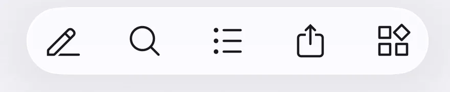
After customization, the toolbar shows the configured items.

Add custom main toolbar items
Use the setMainToolbarItems controller method to replace the viewer’s main toolbar with a list of ToolbarItem entries. The list can include built-in ToolbarItemType values and CustomToolbarItem buttons that use a Dart onPressed callback. The same call works on Android, iOS, and web. Refer to the set main toolbar items(opens in a new tab), toolbar item(opens in a new tab), toolbar item type(opens in a new tab), and custom toolbar item(opens in a new tab) API references for details.
import 'package:flutter/material.dart';import 'package:nutrient_flutter/bindings.dart';
NutrientDocumentView(  documentPath: 'path/to/document.pdf',  onControllerReady: (controller) {    controller.setMainToolbarItems([      // Built-in items — reorder/trim the toolbar on Web; Android and iOS      // keep their native toolbar and ignore these entries.      ToolbarItemType.sidebarThumbnails,      ToolbarItemType.pager,      ToolbarItemType.zoomOut,      ToolbarItemType.zoomIn,      ToolbarItemType.spacer,      ToolbarItemType.search,      // Custom button — added on Android, iOS, and Web. Its tap runs the      // Dart `onPressed` directly; no identifier roundtrip needed.      CustomToolbarItem(        id: 'greet',        title: 'Greet',        onPressed: () => debugPrint('Hello from the toolbar!'),      ),    ]);  },)
You can call setMainToolbarItems again at any time with a different list to add, remove, enable, or disable items dynamically.
The legacy customToolbarItems and onCustomToolbarItemTapped parameters of the deprecated NutrientView widget — along with ToolbarPosition and the identifier/iconName/position fields — are part of the legacy method-channel API and aren’t available on NutrientDocumentView. Use setMainToolbarItems with CustomToolbarItem(id:, title:, onPressed:) instead.
Use custom toolbar item tips
Keep these points in mind when you add custom toolbar items:
- Use a unique
idfor eachCustomToolbarItem. - The
titleproperty sets the button label or tooltip. - The
iconproperty depends on platform support. On web, it accepts a URL, a data uniform resource identifier (URI), or an inline scalable vector graphics (SVG) string. Native platforms currently render thetitleinstead. - The
classNamecustom CSS class andselectedproperty work on web. Thedisabledproperty applies when the platform supports it. - Built-in
ToolbarItemTypeentries work on web only. Include them to keep the toolbar consistent across platforms.
For a runnable example, open toolbar_customization_example in the Catalog app.
Configure web toolbar items
On web, use the cross-platform setMainToolbarItems call above to customize the toolbar. Built-in ToolbarItemType entries reorder or trim the default items, and CustomToolbarItem adds your own buttons.
For web-only options such as responsive groups, configure the toolbar at load time through the toolbarItems property of WebViewConfiguration. Pass WebViewConfiguration as the configuration’s webConfig. Each entry is a NutrientWebToolbarItem. Refer to the web view configuration(opens in a new tab), Nutrient web toolbar item(opens in a new tab), and Nutrient web toolbar item type(opens in a new tab) API references for details.
To group items, create a NutrientWebToolbarItem with type set to NutrientWebToolbarItemType.responsiveGroup and provide an id. Then add subsequent items to the group by setting their responsiveGroup property to the group item’s id.
NutrientDocumentView( documentPath: 'document/path.pdf', configuration: NutrientViewConfiguration( webConfig: WebViewConfiguration( toolbarItems: [ NutrientWebToolbarItem( type: NutrientWebToolbarItemType.custom, title: 'Custom ToolbarItem', onPress: (event) { ScaffoldMessenger.of(context).showSnackBar( const SnackBar(content: Text('Hello from custom button!')), ); }, ), NutrientWebToolbarItem( type: NutrientWebToolbarItemType.responsiveGroup, title: 'Responsive Group', id: 'my-responsive-group', mediaQueries: ['(max-width: 600px)'], ), NutrientWebToolbarItem( type: NutrientWebToolbarItemType.ink, responsiveGroup: 'my-responsive-group', ), NutrientWebToolbarItem( type: NutrientWebToolbarItemType.inkEraser, responsiveGroup: 'my-responsive-group', ), ], ), ),)After customization, the web toolbar shows the configured items.
