Customize the main toolbar on Android
The main toolbar of PdfActivity and PdfUiFragment is a Jetpack Compose toolbar whose content is a list of ToolbarItems. You customize it through three methods on PdfUi: a provider that returns the items to render, a click listener, and an invalidation call. Both hosts and the Compose DocumentState share them. The toolbar involves no menu XML, no Menu, and no ActionBar. If you’re coming from a version before 12.0, the 12 migration guide maps the options-menu overrides onto these methods.
For the annotation, document editing, and content editing toolbars, see customizing contextual toolbars. To render the main toolbar yourself in a Compose layout, see the Compose main toolbar component page.
The default items
PdfActivity fills the toolbar from the configuration: An item appears only when its feature is enabled and licensed. Each default item has a stable ID, exposed as a PdfActivity.MENU_OPTION_* constant:
| Constant | ID | Default action |
|---|---|---|
MENU_OPTION_EDIT_ANNOTATIONS | pspdf__menu_option_edit_annotations | Enters annotation creation mode. |
MENU_OPTION_EDIT_CONTENT | pspdf__menu_option_edit_content | Enters content editing mode. |
MENU_OPTION_SIGNATURE | pspdf__menu_option_signature | Starts the signature tool. |
MENU_OPTION_AI_ASSISTANT | pspdf__menu_option_ai_assistant | Opens the AI Assistant. |
MENU_OPTION_OUTLINE | pspdf__menu_option_outline | Shows the outline sheet with bookmarks, annotations, and document info. |
MENU_OPTION_SEARCH | pspdf__menu_option_search | Opens search: the inline bar inside the toolbar, or the modular search view. |
MENU_OPTION_READER_VIEW | pspdf__menu_option_reader_view | Opens the reader view. |
MENU_OPTION_THUMBNAIL_GRID | pspdf__menu_option_thumbnail_grid | Shows the document overview (page grid). |
MENU_OPTION_DOCUMENT_EDITOR | pspdf__menu_option_document_editor | Enters and leaves document editing; shown only while the page grid is open. |
MENU_OPTION_SHARE | pspdf__menu_option_share | Opens the sharing menu (Open, Print, Save As…). |
MENU_OPTION_SETTINGS | pspdf__menu_option_settings | Shows the settings sheet. |
MENU_OPTION_DOCUMENT_INFO | pspdf__menu_option_info_view | Shows the document info sheet. |
Items that don’t fit the bar move into the overflow menu automatically.
Adding custom actions
Set a ToolbarItemsProvider and an OnToolbarItemClickListener — for example, in onCreate of a PdfActivity subclass. The provider receives the default items in order and returns the list to render. The click listener receives the tapped item’s ID and returns true when it handled the tap:
class CustomActionsActivity : PdfActivity() {
    override fun onCreate(savedInstanceState: Bundle?) {        super.onCreate(savedInstanceState)
        setToolbarItemsProvider { defaultItems ->            defaultItems + ToolbarItem.Button(                actionId = "my.app.bookmark",            // Stable string identity, survives process death.                id = R.id.custom_bookmark,               // R.id, used by the click listener and test tags.                contentDescription = "Bookmark",         // Accessibility label, tooltip and overflow text.                icon = ToolbarIcon.Resource(R.drawable.ic_bookmark),                overflowBehavior = ToolbarItem.OverflowBehavior.AlwaysShow,            )        }
        setOnToolbarItemClickListener { id ->            when (id) {                R.id.custom_bookmark -> { addBookmark(); true }                else -> false // `false` lets the SDK handle its default items.            }        }    }}
public class CustomActionsActivity extends PdfActivity {
@Override protected void onCreate(@Nullable Bundle savedInstanceState) { super.onCreate(savedInstanceState);
setToolbarItemsProvider(defaultItems -> { final List<ToolbarItem> items = new ArrayList<>(defaultItems); items.add(new ToolbarItem.Button( "my.app.bookmark", R.id.custom_bookmark, "Bookmark", new ToolbarIcon.Resource(R.drawable.ic_bookmark), new ToolbarItemState(true, false, true), ToolbarItem.ItemEdge.End, ToolbarItem.OverflowBehavior.AlwaysShow)); return items; });
setOnToolbarItemClickListener(id -> { if (id == R.id.custom_bookmark) { addBookmark(); return true; } return false; }); }}The toolbar’s icon color tints icons automatically, so you don’t tint them yourself.
The item model
A ToolbarItem is immutable data in com.pspdfkit.compose.toolbar.state:
ToolbarItem.Buttonis a plain action.ToolbarItem.Togglehas a selected state, such as an annotation tool.ToolbarItem.Submenugroups nestedchildren, which the contextual and floating toolbars open as a menu. The main toolbar doesn’t, as described in grouping related actions. The SDK’s own main toolbar items are allToolbarItem.Buttons.actionIdis a namespaced string — for example,"my.app.bookmark"— that identifies the action for dispatch and state save and restore.idis theR.idthe click listener receives, and it also derives the Compose test tag.contentDescriptionis the text TalkBack reads, the tooltip on long press, and the text in the overflow menu.iconis aToolbarIcon:Resource(id, tint),Vector(image, tint),Composed { tint -> … }, orNone. UseComposedfor a fully dynamic icon such as a color swatch, andNonefor a text-only item.stateis aToolbarItemStatewithisEnabled,isSelected, andisVisible.overflowBehavioris one ofAlwaysShow,IfRoom(the default),Never(always in the overflow menu), orAlwaysAsText(a labeled item).positionis anItemEdge,Start, orEnd, which groups items at either end of the bar.
Placing an item at a position
The provider returns a list, so insertion order is placement. To put an item after the outline item:
setToolbarItemsProvider { defaultItems -> val index = defaultItems.indexOfFirst { it.id == PdfActivity.MENU_OPTION_OUTLINE } defaultItems.toMutableList().apply { // Fall back to appending: while the page grid is open the outline item is not in the list. add(if (index >= 0) index + 1 else size, myItem) }}setToolbarItemsProvider(defaultItems -> { final List<ToolbarItem> items = new ArrayList<>(defaultItems); int index = -1; for (int i = 0; i < items.size(); i++) { if (items.get(i).getId() == PdfActivity.MENU_OPTION_OUTLINE) index = i; } items.add(index >= 0 ? index + 1 : items.size(), myItem); return items;});The default list changes shape with the active view. While the document overview is displayed, it holds only the grid’s own items. These are the document editor item, the grid item that closes it, and the overflow-only settings and document info items. The provider runs again on every refresh, including when the grid opens and closes, so never index into defaultItems blindly. Build the result from whatever it holds at the time.
Removing default actions
Filter the item out, or return a copy with isVisible = false:
setToolbarItemsProvider { defaultItems -> defaultItems.filter { it.id != PdfActivity.MENU_OPTION_OUTLINE }}setToolbarItemsProvider(defaultItems -> { final List<ToolbarItem> items = new ArrayList<>(defaultItems); items.removeIf(item -> item.getId() == PdfActivity.MENU_OPTION_OUTLINE); return items;});Removing an item doesn’t disable the feature it represents: The outline can still be opened programmatically, for example. To disable a feature and remove every entry point for it, use the configuration instead:
| Configuration option | Result |
|---|---|
annotationEditingEnabled(false) | Disables annotation editing and removes all related UI elements. |
outlineEnabled(false) | Disables the outline and removes all related UI elements. |
searchEnabled(false) | Disables search functionality and removes all related UI elements. |
settingsMenuEnabled(false) | Removes the settings menu. |
setEnabledShareFeatures(ShareFeatures.none()) | Disables share functionality and removes all related UI elements. |
thumbnailGridEnabled(false) | Disables the thumbnail grid and removes all related UI elements. |
documentEditorEnabled(false) | Removes document editing, including the document editor item. |
Changing an item’s state
Return a copy of the default item with a new state. ToolbarItem is a sealed type, so copy the variant you matched:
setToolbarItemsProvider { defaultItems -> defaultItems.map { item -> if (item.id == PdfActivity.MENU_OPTION_SHARE && item is ToolbarItem.Button) { item.copy(state = item.state.copy(isEnabled = documentIsSaved)) } else { item } }}When the state your provider reads changes, call invalidateToolbarItems() and the provider runs again:
documentIsSaved = trueinvalidateToolbarItems()documentIsSaved = true;invalidateToolbarItems();Intercepting default actions
The click listener runs before the SDK’s own handler, so returning true for a default item suppresses the built-in action and leaves the toolbar untouched. This is how you keep the settings, document info, or outline item but show your own screen behind it:
setOnToolbarItemClickListener { id -> when (id) { PdfActivity.MENU_OPTION_SETTINGS, PdfActivity.MENU_OPTION_DOCUMENT_INFO, PdfActivity.MENU_OPTION_OUTLINE -> { showMyOwnScreen(id) true // Handled, so the SDK does not open its own. } else -> false }}setOnToolbarItemClickListener(id -> { if (id == PdfActivity.MENU_OPTION_SETTINGS || id == PdfActivity.MENU_OPTION_DOCUMENT_INFO || id == PdfActivity.MENU_OPTION_OUTLINE) { showMyOwnScreen(id); return true; } return false;});In your own settings screen, read the current values through the active PdfActivityConfiguration, PdfUi.getScreenTimeout, and PSPDFKitPreferences, and apply changes back through the same three. The Catalog app’s CustomSdkUiExample does exactly this, using public APIs only. To keep the SDK’s own settings rows and replace just one of them, compose NutrientSettingsView instead; see custom settings UI.
Grouping related actions
The main toolbar doesn’t open submenus. A ToolbarItem.Submenu in the main toolbar renders as a single button. A tap reaches the click listener with the submenu’s own id, and its children are never shown. To group related actions, add them as separate items with overflowBehavior = ToolbarItem.OverflowBehavior.Never, which lists them together in the overflow menu. Alternatively, open your own menu, dialog, or bottom sheet from the click listener:
setToolbarItemsProvider { defaultItems -> defaultItems + listOf( ToolbarItem.Button( actionId = "my.app.export.pdf", id = R.id.export_pdf, contentDescription = "Export as PDF", icon = ToolbarIcon.None, overflowBehavior = ToolbarItem.OverflowBehavior.Never, ), ToolbarItem.Button( actionId = "my.app.export.png", id = R.id.export_png, contentDescription = "Export as image", icon = ToolbarIcon.None, overflowBehavior = ToolbarItem.OverflowBehavior.Never, ), )}Submenus do open on the contextual toolbars and on NutrientFloatingToolbar. There, a tap runs the group’s representative child and a long press opens the children, unless the submenu sets opensSubmenuOnClick = true.
The share item isn’t a submenu: It opens the sharing menu, which is a bottom sheet with Open, Print, and Save As…. To add actions there, or to change its entries, use setSharingActionMenuListener and the ActionMenu API, as CustomSharingMenuExample in the Catalog app does. PdfUi.showSaveAsDialog() opens the Save As dialog directly.
Navigation icon
The toolbar has no navigation (up or back) icon by default. Set one with setToolbarNavigationIcon, and handle its tap with setOnToolbarNavigationClickListener. Both live on PdfUi, so they’re identical on PdfActivity and PdfUiFragment:
setToolbarNavigationIcon(ToolbarIcon.Resource(R.drawable.ic_arrow_back), "Back")setOnToolbarNavigationClickListener { finish() }// Remove it again:setToolbarNavigationIcon(null, null)setToolbarNavigationIcon(new ToolbarIcon.Resource(R.drawable.ic_arrow_back), "Back");setOnToolbarNavigationClickListener(() -> finish());The icon renders at the leading edge as a standard toolbar item, with the 48dp target, the theme tint, and a tooltip. Passing null as the label falls back to the localized “Navigate up.” Without a listener, the tap does nothing.
Using an embedded PdfUiFragment
The same three methods exist on PdfUiFragment, so a host activity customizes the toolbar without subclassing anything:
val pdfUiFragment = supportFragmentManager.findFragmentByTag(TAG) as PdfUiFragmentpdfUiFragment.setToolbarItemsProvider { defaultItems -> defaultItems + ToolbarItem.Button( actionId = "my.app.share", id = R.id.custom_share, contentDescription = "Share", icon = ToolbarIcon.Resource(R.drawable.ic_share), )}pdfUiFragment.setOnToolbarItemClickListener { id -> if (id == R.id.custom_share) { share(); true } else false}// When your own state changes:pdfUiFragment.invalidateToolbarItems()final PdfUiFragment pdfUiFragment = (PdfUiFragment) getSupportFragmentManager().findFragmentByTag(TAG);pdfUiFragment.setToolbarItemsProvider(defaultItems -> { final List<ToolbarItem> items = new ArrayList<>(defaultItems); items.add(new ToolbarItem.Button("my.app.share", R.id.custom_share, "Share", new ToolbarIcon.Resource(R.drawable.ic_share), new ToolbarItemState(true, false, true), ToolbarItem.ItemEdge.End, ToolbarItem.OverflowBehavior.IfRoom)); return items;});pdfUiFragment.setOnToolbarItemClickListener(id -> { if (id == R.id.custom_share) { share(); return true; } return false;});The provider and the listeners survive configuration changes and the fragment’s own view recreation. The ToolbarCoordinator behind the toolbar is reachable with pdfUiFragment.nutrientToolbarCoordinator() for the lower-level operations. setMainToolbarHostVisible(false) hides the toolbar at runtime without the SDK’s visibility logic undoing it. setMainToolbarInsets changes the insets it reserves when the fragment doesn’t sit at the top of the window. See UI visibility and the toolbar hosting page.
Using the Compose DocumentView
DocumentState exposes the same three methods, safe to call before the DocumentView attaches:
val documentState = rememberDocumentState(uri, configuration)
LaunchedEffect(documentState) {    documentState.setToolbarItemsProvider { defaultItems -> defaultItems + myItem }    documentState.setOnToolbarItemClickListener { id -> if (id == R.id.my_item) { doThing(); true } else false }    documentState.setToolbarNavigationIcon(ToolbarIcon.Resource(R.drawable.ic_back), "Back")    documentState.setOnToolbarNavigationClickListener { onBack() }}
To place the toolbar yourself, or restyle it as a pill or a floating toolbar, disable the SDK’s mount with defaultToolbarEnabled(false). Then compose NutrientMainToolbar from documentState.toolbarCoordinator.
Theming
The toolbar reads the XML theme attributes pspdf__mainToolbarStyle and pspdf__actionBarIconsStyle, so an existing theme keeps working. Programmatically, PdfActivity.setMainToolbarColorScheme(UiColorScheme) overrides the colors of the toolbar row, title, title overlay, and overflow menu at runtime, and null clears the override. See appearance styling for the attributes and the Compose color scheme.
Customizing the document settings menu
You can control which items are shown in the settings sheet the settings item opens.
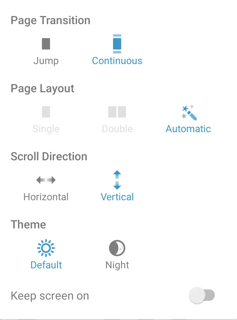
To specify which items should be shown, use PdfActivityConfiguration.Builder#setSettingsMenuItems. For example, the following code shows only the page transition, page layout, and document theme:
configuration.setSettingsMenuItems(EnumSet.of( SettingsMenuItemType.THEME, SettingsMenuItemType.PAGE_LAYOUT, SettingsMenuItemType.PAGE_TRANSITION ))configuration.setSettingsMenuItems(EnumSet.of( SettingsMenuItemType.THEME, SettingsMenuItemType.PAGE_LAYOUT, SettingsMenuItemType.PAGE_TRANSITION ));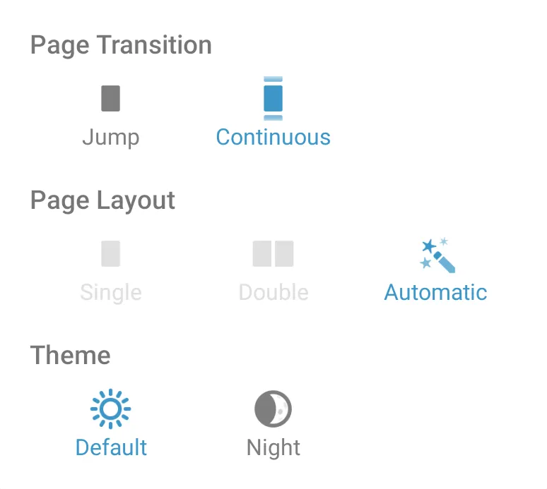
To exclude the settings menu completely, use PdfActivityConfiguration.Builder#settingsMenuEnabled(false).
Working examples
In the Catalog app:
MainToolbarCustomizationExample(Toolbars & Menus) — Custom items and click routing, plus a host-renderedNutrientMainToolbarin a rounded, elevated container.DocumentSharingExampleandCustomSharingMenuExample(Java, Sharing) — Overflow-only custom items, and a customized sharing menu.DocumentSwitcherExample(Java) — A custom item that switches documents.CustomSdkUiExample(Custom Settings, Info and Outline UI) — Intercepting the settings, info, and outline items.