Powered by Nutrient
You can find the images for the Powered by Nutrient logo in various formats and styles here.
Guidelines
- Contact sales@nutrient.io before you use our logo.
- Tapping or clicking the logo should open our website (https://www.nutrient.io).
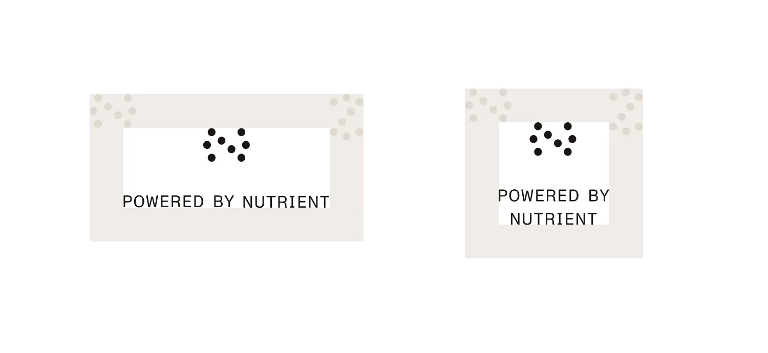
- The logo comes in two basic shapes: landscape and square.
- When placing the logo, make sure there’s enough whitespace around it.
- When sizing the logo, make sure the text is large enough to be readable.
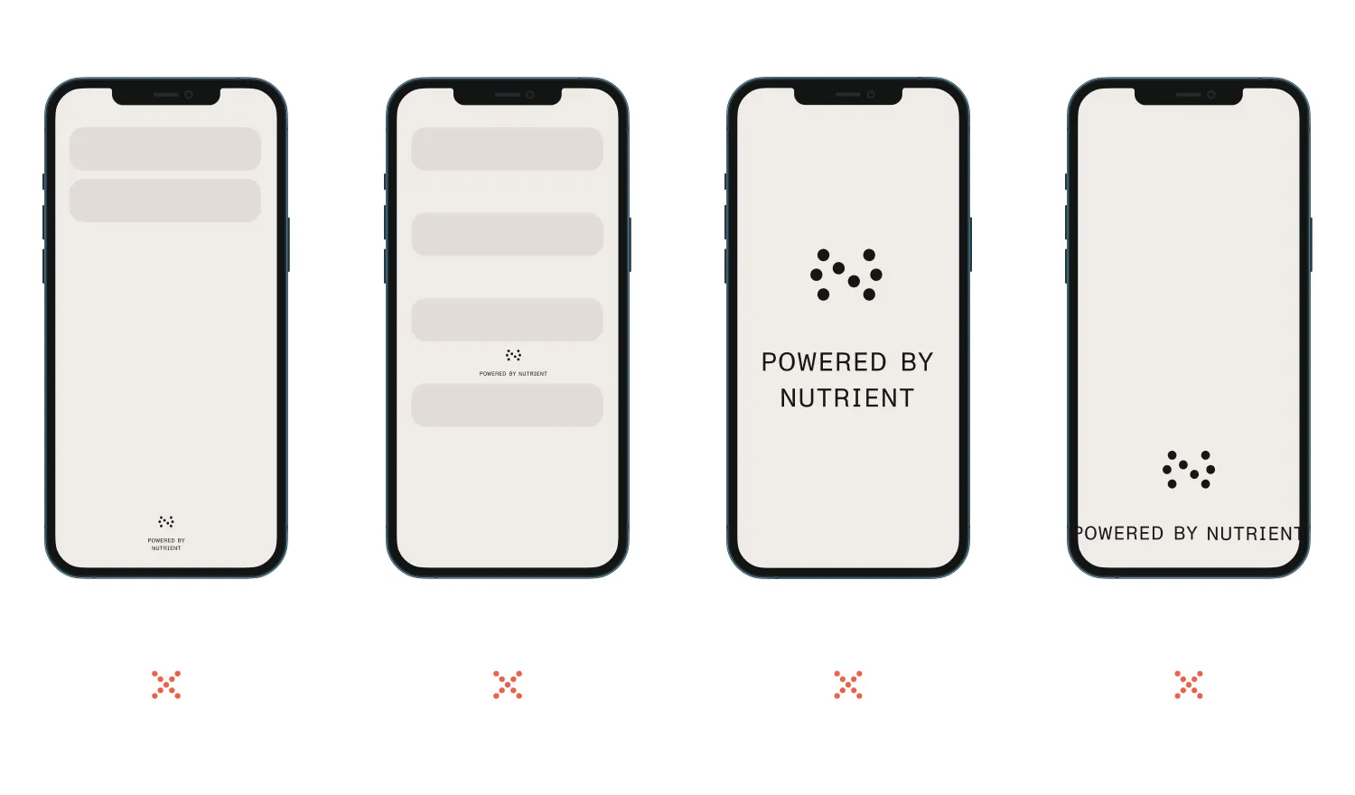
- Do not place the logo too far away from other UI elements; the logo should come into view during normal scrolling operations.
- Do not place the logo between UI elements; it should be an element clearly separate from your user interface.
- Do not cover large portions of the screen area with the logo.
- Do not cut off the logo; make sure both the view transformation and the device orientation don’t affect the logo’s visibility.
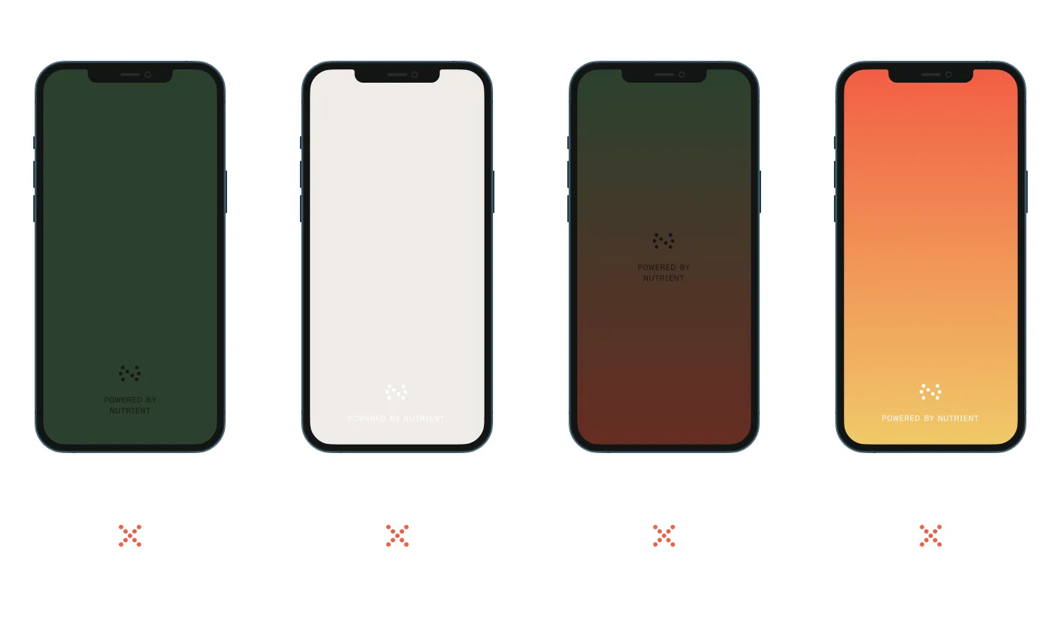
- Make sure the contrast between the logo and the container view’s background color is high.
- Use the black version of the logo on white or bright backgrounds.
- Use the white version on colored, textured, or dark backgrounds.
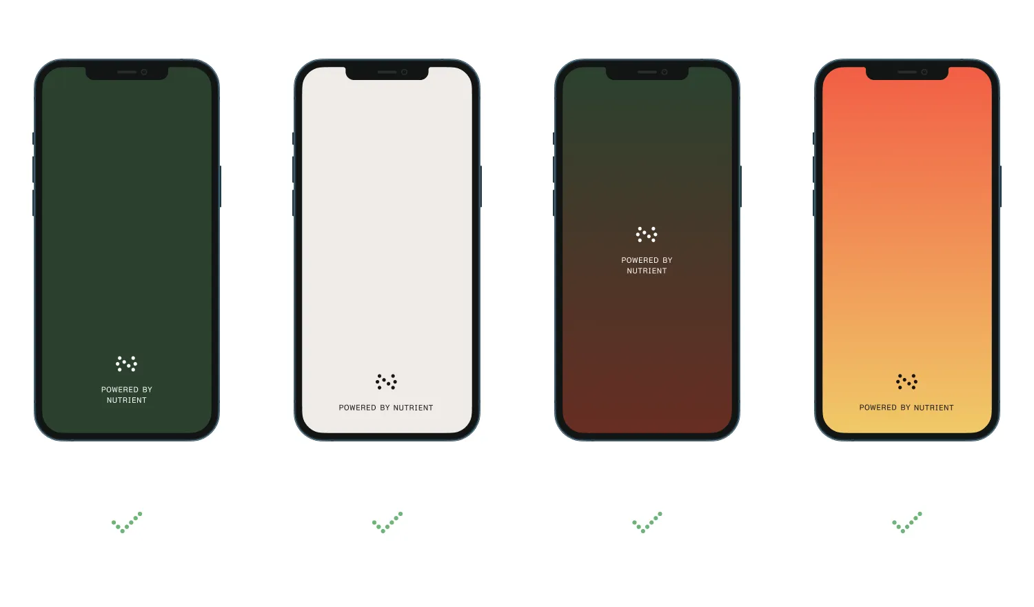
- When using the logo, you can adjust its tint to match your application’s look and feel as long as the logo-to-background contrast stays high and the text is readable.
- If you’re unsure if the design of the view showing the logo is acceptable, feel free to get in touch with our team via sales@nutrient.io.