Custom sidebars
Sidebars can be customized using the sidebar slot in the ui configuration. You can read more about slots in the introduction guide. The sidebar slot lets you replace the default sidebar with a custom implementation using the slots API.
Support for the sidebar slot is currently limited to adding custom sidebars. We’ll be expanding this in the future.
Adding a slot for a custom sidebar
Slots for sidebars can be added inside the sidebar object in the ui configuration:
NutrientViewer.load({ // ... Your configuration. ui: { sidebar: { // Configuration for sidebar customization. }, },});A custom sidebar slot can be represented by a unique string identifier. Similar to other slots, you can pass a function as a value that returns an object with a render method.
Consider a custom sidebar with the identifier myCustomSidebar:
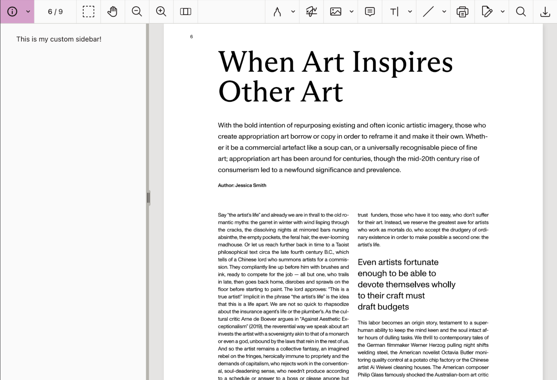
NutrientViewer.load({ // ... Your configuration. ui: { sidebar: { myCustomSidebar: (instance, id) => ({ render: (params) => { const div = document.createElement("div"); div.innerText = "This is my custom sidebar!"; div.style.padding = "10px"; div.style.color = "#ccc"; return div; }, }), }, },});This takes care of rendering the custom sidebar. However, it’s necessary to tell the SDK to display the sidebar before it’s visible in the UI. This can be done using the sidebarMode view state.
Sidebar mode
The sidebar mode view state property (sidebarMode) controls which sidebar is currently visible. In addition to the values for default (built-in) sidebars, it also accepts string values corresponding to the identifiers of custom sidebar slots.
To display the custom sidebar in the UI, you can use instance.setViewState() and set sidebarMode to myCustomSidebar, which corresponds to the same identifier used in the configuration slot:
NutrientViewer.load({ // ... Your configuration. ui: { sidebar: { myCustomSidebar: () => ({ render: () => { const div = document.createElement("div"); div.innerText = "This is my custom sidebar!"; div.style.padding = "20px 32px"; div.style.color = "#1A1414"; return div; }, }), }, },}).then((instance) => { // `myCustomSidebar` corresponds to the ID of the custom sidebar slot defined in the UI -> sidebar configuration. instance.setViewState((viewState) => viewState.set("sidebarMode", "myCustomSidebar"), );});You’ll see the custom sidebar rendered in the UI after the SDK loads.
Initial view state
The code above showed how to add a custom sidebar and display it programmatically using the view state.
In addition to triggering the custom sidebar with setViewState, you can also set the initial view state to open the custom sidebar when the viewer loads. This relies on the same sidebarMode view state property:
NutrientViewer.load({ // ... Your configuration. initialViewState: new NutrientViewer.ViewState({ // `myCustomSidebar` corresponds to the ID of the custom sidebar slot defined in the UI -> sidebar configuration. sidebarMode: "myCustomSidebar", }), ui: { sidebar: { myCustomSidebar: () => ({ render: () => { const div = document.createElement("div"); div.innerText = "This is my custom sidebar!"; div.style.padding = "10px"; div.style.color = "#ccc"; return div; }, }), }, },});Lifecycle methods
Similar to other UI slots, custom sidebars support both the onMount and onUnmount lifecycle methods.
onMount— Called when the custom sidebar is mounted. You can use this to perform any setup actions, such as adding event listeners and analytics events.onUnmount— Called when the custom sidebar is unmounted. You can use this to perform any cleanup actions, such as removing event listeners.
Below is an example of how you can use lifecycle methods:
NutrientViewer.load({  // ... Your configuration.  ui: {    sidebar: {      myCustomSidebar: (instance, id) => {        const div = document.createElement("div");        div.innerText = "This is my custom sidebar!";        div.style.padding = "10px";        div.style.color = "#ccc";
        return {          render: () => div,          onMount: (id) => {            console.log(`Custom sidebar ${id} mounted`);            // Perform any setup actions here.          },          onUnmount: (id) => {            console.log(`Custom sidebar ${id} unmounted`);            // Perform any cleanup actions here.          },        };      },    },  },});
Adding a toolbar item
You may want to add a toolbar item in the viewer sidebar dropdown menu to trigger the custom sidebar.
You can use the toolbar items API to add a custom toolbar item that will toggle your custom sidebar:
NutrientViewer.load({  // ... Your configuration.  ui: {    sidebar: {      myCustomSidebar: () => ({        render: () => {          const div = document.createElement("div");          div.innerText = "This is my custom sidebar!";          div.style.padding = "10px";          div.style.color = "#ccc";          return div;        },      }),    },  },}).then((instance) => {  // Define a custom toolbar item.  const myCustomSidebarToolbarItem = {    type: "custom",    id: "myCustomSidebarToolbarItem",    title: "My Custom Sidebar",    dropdownGroup: "sidebar",    icon: '<svg xmlns="http://www.w3.org/2000/svg" viewBox="0 0 24 24" fill="hotpink"><path d="M12 22C6.47715 22 2 17.5228 2 12C2 6.47715 6.47715 2 12 2C17.5228 2 22 6.47715 22 12C22 17.5228 17.5228 22 12 22ZM12 20C16.4183 20 20 16.4183 20 12C20 7.58172 16.4183 4 12 4C7.58172 4 4 7.58172 4 12C4 16.4183 7.58172 20 12 20ZM11 7H13V9H11V7ZM11 11H13V17H11V11Z"></path></svg>',    onPress: () => {      instance.setViewState((viewState) =>        viewState.set(          "sidebarMode",          viewState.sidebarMode === "myCustomSidebar"            ? null            : "myCustomSidebar",        ),      );    },  };
  // Add the custom toolbar item to the existing toolbar items.  instance.setToolbarItems([    ...NutrientViewer.defaultToolbarItems,    myCustomSidebarToolbarItem,  ]);});
The toolbar item to toggle your custom sidebar will now be available in the sidebar dropdown menu.

Selection state for toolbar item
The example above doesn’t provide a selected state for the custom toolbar item, so the toolbar item won’t appear selected when the custom sidebar is open, although it will work correctly.
It’s possible to add an event listener for viewState.change event to update the selected state of the toolbar item based on the current sidebarMode:
NutrientViewer.load({  // ... Your configuration.  ui: {    sidebar: {      myCustomSidebar: () => ({        render: () => {          const div = document.createElement("div");          div.innerText = "This is my custom sidebar!";          div.style.padding = "20px 32px";          div.style.color = "#1A1414";          return div;        },      }),    },  },}).then((instance) => {  // Define a custom toolbar item.  const myCustomSidebarToolbarItem = {    type: "custom",    id: "myCustomSidebarToolbarItem",    title: "My Custom Sidebar",    dropdownGroup: "sidebar",    icon: '<svg xmlns="http://www.w3.org/2000/svg" viewBox="0 0 24 24" fill="#1A1414"><path d="M12 22C6.47715 22 2 17.5228 2 12C2 6.47715 6.47715 2 12 2C17.5228 2 22 6.47715 22 12C22 17.5228 17.5228 22 12 22ZM12 20C16.4183 20 20 16.4183 20 12C20 7.58172 16.4183 4 12 4C7.58172 4 4 7.58172 4 12C4 16.4183 7.58172 20 12 20ZM11 7H13V9H11V7ZM11 11H13V17H11V11Z"></path></svg>',    onPress: () => {      instance.setViewState((viewState) =>        viewState.set(          "sidebarMode",          viewState.sidebarMode === "myCustomSidebar"            ? null            : "myCustomSidebar",        ),      );    },  };
  // Add the custom toolbar item to the existing toolbar items.  instance.setToolbarItems([    ...NutrientViewer.defaultToolbarItems,    myCustomSidebarToolbarItem,  ]);
  // Update the selected state of the toolbar item based on the current `sidebarMode`.  instance.addEventListener("viewState.change", (viewState, prevViewState) => {    if (viewState.sidebarMode === prevViewState.sidebarMode) {      return;    }
    instance.setToolbarItems((items) =>      items.map((item) =>        item.id === "myCustomSidebarToolbarItem"          ? { ...item, selected: viewState.sidebarMode === "myCustomSidebar" }          : item,      ),    );  });});
The toolbar item will now appear selected when the custom sidebar is open.