Using grid questions in forms
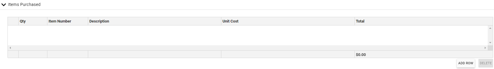
Use the grid question (also known as a Line Item question) to create tables or lists for users to enter text or numbers. Grid questions are ideal for collecting structured data such as expense items, product lists, or any scenario requiring multiple related data points per entry.
Prerequisites
Before creating grid questions, ensure you have:
- Form editor access — Permission to create and modify forms in your workflow system
- Basic form knowledge — Familiarity with creating basic form questions and containers
- Data planning — A clear understanding of what data you need to collect and how it should be structured
Creating a grid question
To create a grid question, drag the Grid icon from the question palette and drop it into a container. You can immediately add a label for the grid, or you can click the Edit icon and add a label when you begin configuring the grid.
Configuring the grid
When you hover over the grid, clicking the Edit icon will open the Grid Configuration window.
The Grid Configuration window displays multiple tabs for different configuration options. The Basics tab is selected by default.
Basic settings
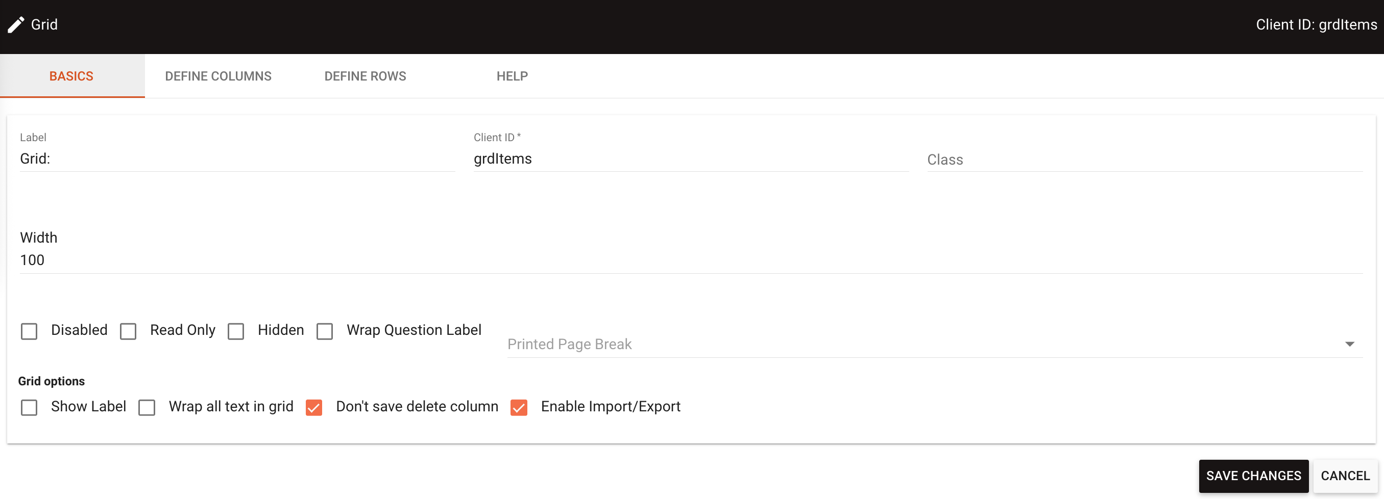
On the Basics tab, you can configure:
- Label — The grid label (shown above the grid on the layout)
- Client ID — A unique identifier for referencing the grid in JavaScript or workflows
- Class — CSS classes for custom styling
- Width — The grid width (by default, the grid will fill 100 percent of the container it’s in)
- Disabled — When checked, prevents users from interacting with the grid
- Read Only — When checked, users can view but not edit the grid data
- Hidden — When checked, hides the grid from view by default
- Wrap Question Label — Controls whether the label text wraps to multiple lines
- Printed Page Break — Controls pagination behavior when printing
Additionally, under Grid options, you can configure:
- Show Label — Controls whether the label appears above the grid
- Wrap all text in grid — When checked, wraps text content within grid cells
- Don’t save delete column — Controls whether deleted column data is preserved
- Enable Import/Export — Enables drag-and-drop, copy-paste, and file import/export functionality
Setting up columns
In the Define Columns tab, you configure the columns you want in the grid.
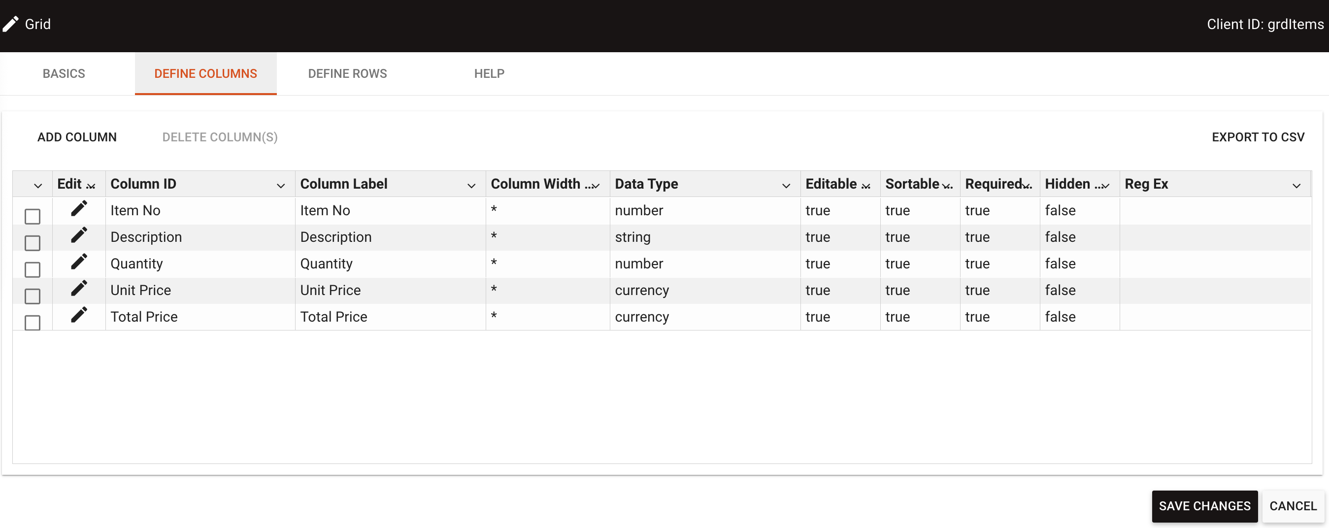
Adding a column
Click Add Column to open the column configuration dialog where you can set each column’s properties.
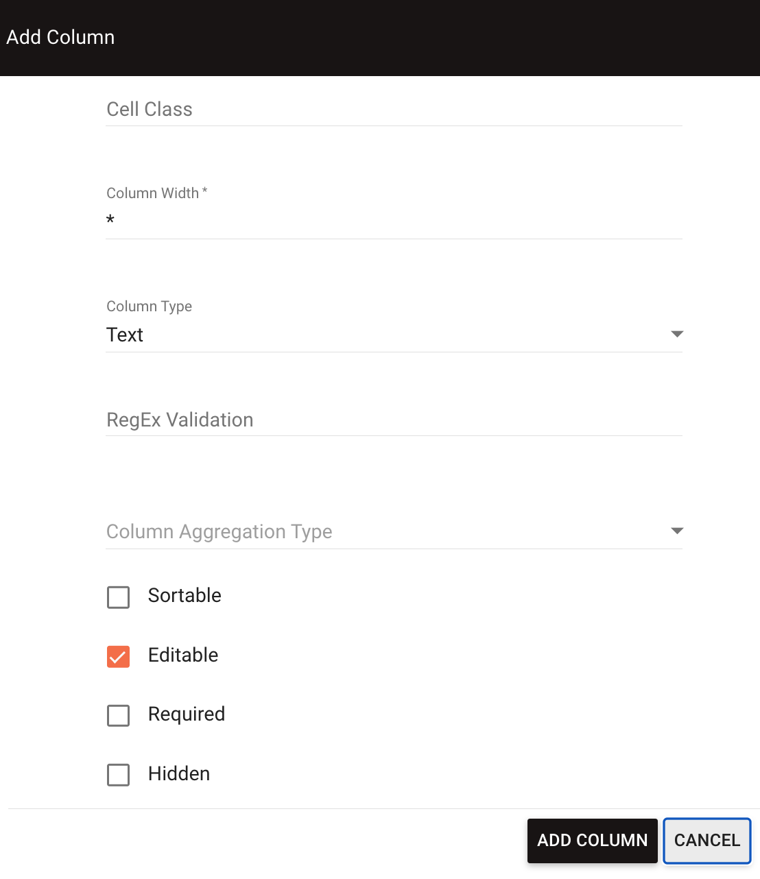
In the Add Column window, you can configure:
- Column Client ID — A unique identifier for referencing the column in JavaScript, similar to a question’s Client ID
- Column Label — The column header text displayed in the grid
- Class — CSS classes for custom column styling
- Width — The column width (columns are distributed evenly by default, indicated by an asterisk (*))
- Data Type — The type of data the column accepts (text, static text, number, date, Boolean, file attachment, select list, currency, row aggregation)
Static text enables you to add persistent text that can’t be edited in the column. Row aggregation enables you to calculate values (Sum, Average, Column Count, Min, Max, or Multiply) across columns in the row. Row aggregation can be combined with aggregation type to aggregate the results of the row aggregation.
- Aggregation Type — Calculates values, including Sum, Average, Row Count, Min, Max. This displays in the footer of the grid
You need to enable Show Footer in the Define Rows tab to make the calculation visible.
- Sortable — When checked, enables users to sort the grid by clicking on the column header
- Editable — When checked, enables users to edit the data directly in the grid
Even if this isn’t checked, users can still enter the value into the Add Row dialog.
- Required — When checked, all prerendered rows must have this column completed, including unused rows
- Hidden — When checked, hides the column from view in the grid
Setting up rows
In the Define Rows tab, you can configure the initial grid layout. This configuration is optional and only needed if you want to predefine rows.
- Rows Specified — The number of rows to display initially in the grid
- Grid Height (in Rows) — The number of rows to display at one time. If you set a height taller than the number of rows specified, blank space appears at the bottom of the grid. If you set a height shorter than the number of rows, a scroll bar automatically appears
- Render — Click this button to generate the grid preview with your configured rows and columns
For columns defined as Static Text, you can click on individual cells in the preview and add the desired text directly.
At the bottom of the Define Rows tab, you can configure additional options:
- Show Footer — When checked, displays a footer row at the bottom of the grid to show aggregation calculations
- Show Add Row Button — When checked, displays an Add Row button that enables users to insert additional rows into the grid
- Allow users to delete rows — When checked, displays a Delete button that enables users to remove rows from the grid
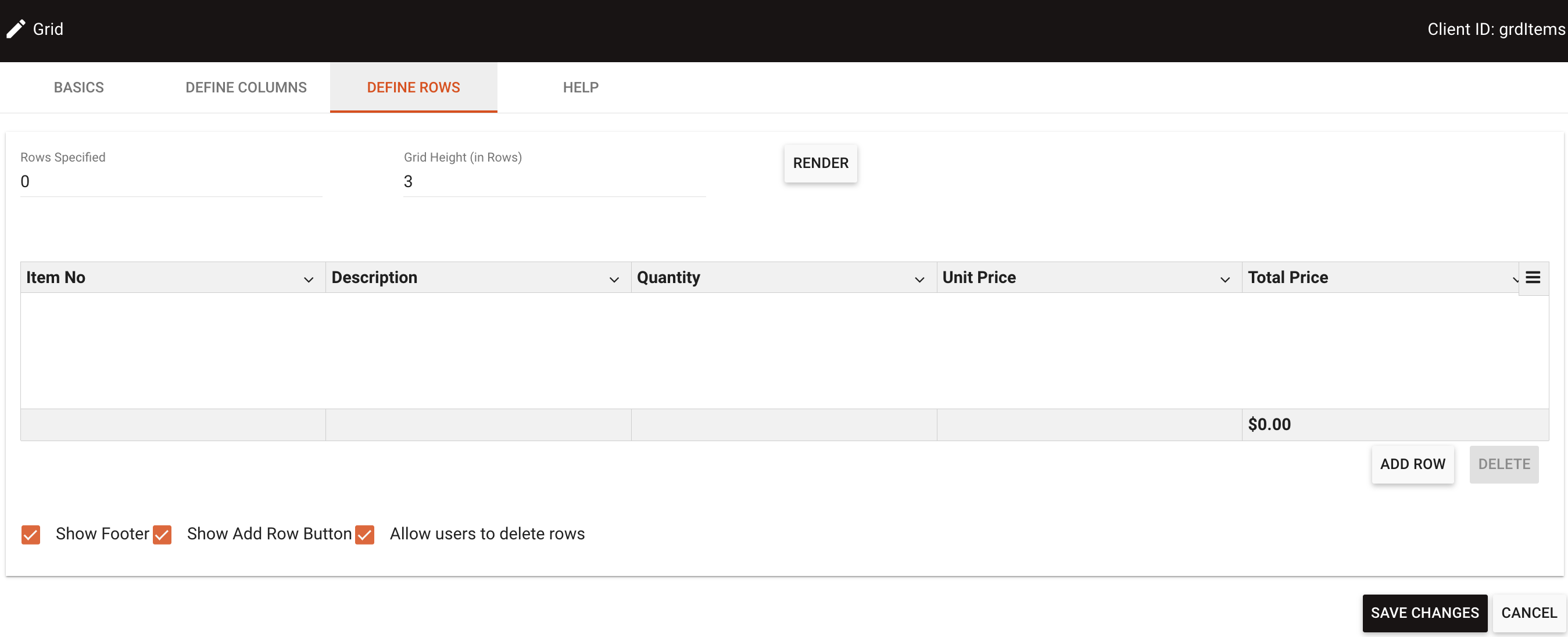
When users click the Add Row button, they receive a dialog box to add data in a new row. The dialog displays fields vertically while keeping the same column headings.
Importing and exporting data
Grid questions support importing data from spreadsheets, CSV files, and other sources, as well as exporting grid data to CSV format. This streamlines data entry when you have existing tabular data.
To enable import and export functionality:
- In the Basics tab of the grid configuration, check the Enable Import/Export checkbox
- Save the grid configuration
Drag-and-drop import
You can drag content directly onto the grid to import data:
- CSV files — Drag CSV files from your file system onto the grid
- Table selections — Select and drag table data from Excel, Google Sheets, or other spreadsheet applications onto the grid
The import process displays a confirmation dialog with a data preview, enabling you to review the data and choose whether to append to or replace existing grid content.
Other import and export methods
Additional ways to import and export data:
- Copy and paste — Copy data from spreadsheet applications and paste directly into the grid
- Import from file — Use the grid menu to browse and select CSV files
- Export to CSV — Export grid data to CSV format for use in other applications
For detailed instructions on importing and exporting grid data, including screenshots and workflows, refer to the importing and exporting grid data guide.
Example use cases
- Expense reporting — Create columns for Date, Description, Category, and Amount with currency data type. Enable aggregation to automatically calculate total expenses.
- Product ordering — Set up columns for Item Name, Quantity (number), Unit Price (currency), and Total (calculated using row aggregation multiply function).
- Employee evaluation — Use columns for Criteria (static text), Rating (select list), and Comments (text) to create structured feedback forms.
Troubleshooting
- Grid not displaying correctly — Ensure you clicked the Render button after making configuration changes.
- Required columns causing validation errors — Remember that if you mark a column as required, all prerendered rows must be completed, including empty rows.
- Scroll bar appearing unexpectedly — Check your Grid Height setting in the Define Rows tab. If the height is shorter than the number of rows, a scroll bar will appear.
- Aggregation totals not showing — Verify that Show Footer is enabled in the Define Rows tab and that you’ve set an Aggregation Type for the relevant columns.
- Users can’t add new rows — Confirm that Show Add Row is enabled in the Define Rows tab configuration.
For additional form building guidance, refer to the creating forms and form questions guides.