Adding an HTML Panel widget
This guide explains how to add and configure an HTML Panel widget on a dashboard in Workflow Automation.
The HTML Panel widget can be added to your dashboard and is used frequently for a variety of purposes, including:
- Making an announcement
- Providing links to processes or external pages
- Displaying videos
- Adding third-party widgets
Adding an HTML Panel widget
To add an HTML Panel widget, follow the steps below:
- Go to the Dashboards layout page for a dashboard.
- Click Add Widget in the upper-right corner of the page.
- On the pop-up that appears, select HTML Panel and click Add Widget to proceed. Click Cancel to terminate the operation.
Newly added widgets appear at the bottom of the dashboard. Scroll down to find, move, or edit them.
Adding content to the widget
The HTML Panel widget provides two modes for managing content: Editor mode for creating and formatting content, and Preview mode for viewing how it will appear to users.
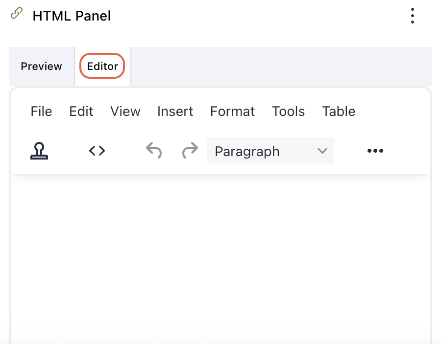
Editor mode
Once added, click Editor in the widget’s header to customize the content. The HTML Panel widget offers a full-featured rich text editor, similar to what you’d find in a word processor. You can:
- Format text using bold, italics, underline, and strikethrough
- Change font family, size, color, and background highlight
- Align text to the left, center, or right, or justify it
- Add numbered or bulleted lists
- Insert:
- Images from a URL or file
- Videos (for example, YouTube embeds)
- Hyperlinks
- Tables
- Symbols, emojis, and special characters
- Toggle to the HTML Source Code (
<>) view for advanced customizations - Add bookmarks and placeholders
Click the three-dot menu on the toolbar to access additional formatting and embedding options.
Tips for styling with inline CSS and tables
When using the HTML Panel widget, inline CSS is an effective way to control how content appears without needing external stylesheets. Use inline styles to customize fonts, colors, spacing, borders, and alignment directly within HTML elements. For example, you can use style="color: #2e6da4; font-size: 16px;" to make text visually consistent and readable.
Tables can be especially useful for structuring announcements, contact information, or comparative data. Apply inline styles — for example, style="border: 1px solid #ccc; padding: 8px; text-align: left;" — to control layout and presentation. Be sure to keep designs clean and responsive and avoid overly complex styles that may break on smaller screen sizes.
To help generate well-formatted HTML and inline styles, you can use the following tools:
- Nutrient Document Authoring(opens in a new tab) — WYSIWYG editor that lets you design and preview styled content before copying it into the widget.
- Tables Generator(opens in a new tab) — Ideal for designing HTML tables with custom styles and then copying the code directly.
- CSS3 Generator(opens in a new tab) — Useful for generating inline CSS styles for fonts, backgrounds, shadows, borders, and more.
These tools speed up the process of creating attractive, functional HTML content for your dashboards, and no deep coding knowledge is required.
Tables Generator and CSS3 Generator sites are not affiliated with Workflow Automation and are intended for informational purposes only.
Inserting templates and launching processes
Click the Insert template
 icon to insert preformatted buttons that link to processes and reports within Workflow Automation.
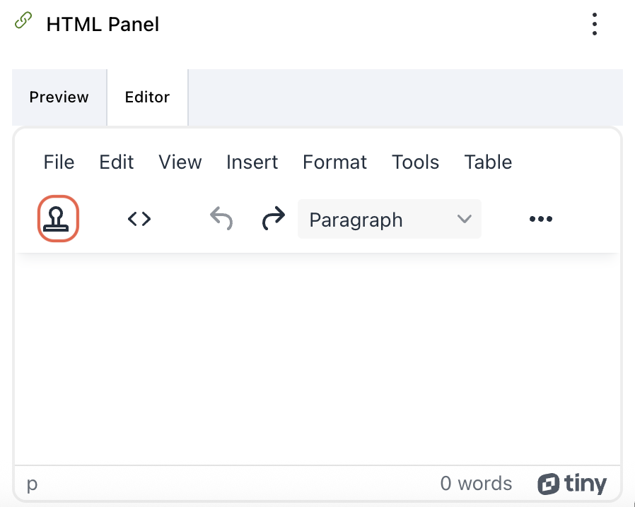
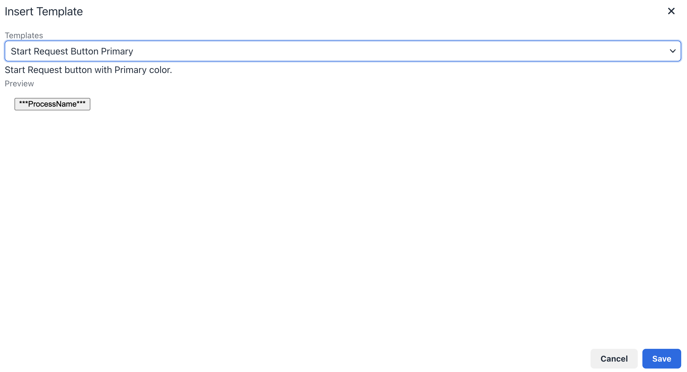
On the pop-up that appears, select a template from the dropdown and click Save in the lower-right corner. Click Cancel to terminate the operation.
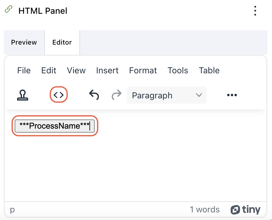
The selected template button will now appear in the editor. To link it to a specific process, click
<>Source Code in the editor.On the screen that appears, replace the
ProcessSIDin the code with the actual process SID. To find the actual process SID:
- Open the process you want the button to launch in a separate window.
- Go to Process Detail > Links/API Options for that process.
- The Process SID will be listed at the top of the page. Copy this SID and paste it into the code. This ensures the button will launch the specific process you intend.
- To rename the button label, edit the
ProcessNamevalue in the code with the name you want users to see.
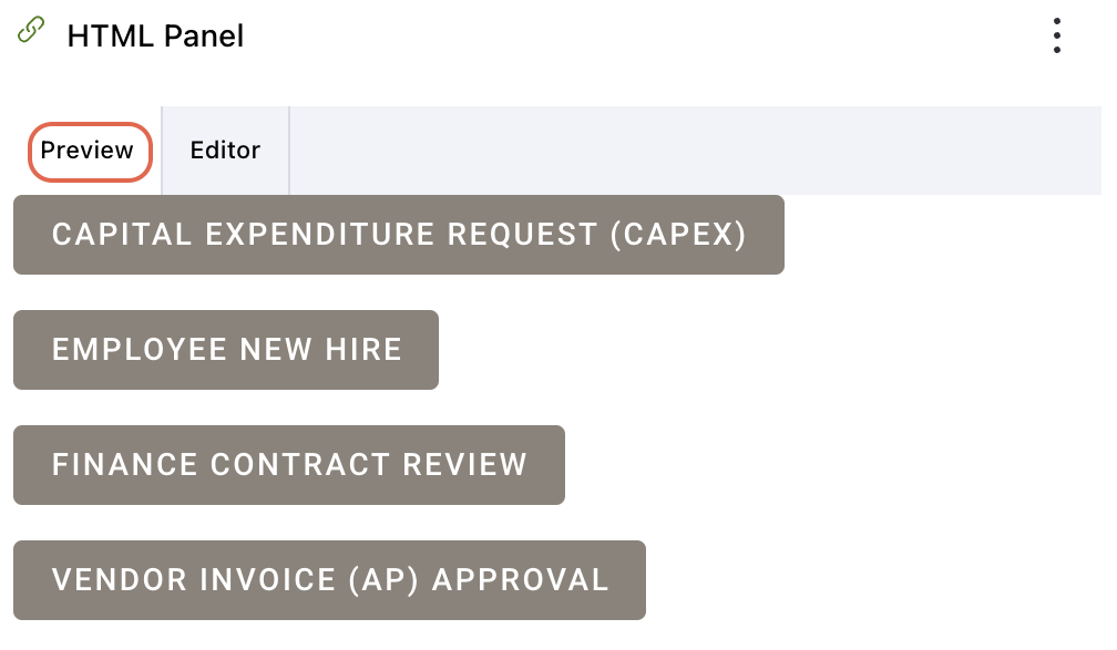
Preview mode
Click Preview in the widget’s header to see how the HTML Panel widget will appear to end users. This mode enables you to review any formatting, layout, links, or embedded content before saving, ensuring the widget displays as intended. To make further edits, switch back to Editor mode.
Editing widget settings
To edit widget settings:
- Click the three dots
 icon in the upper-right corner of the widget and select the Edit widget option from the dropdown.
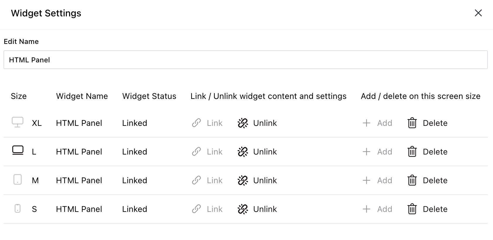
 - On the pop-up that appears, you can edit the following settings:
- Widget name — Modify the label that appears on the widget header.
- Link/unlink widget content and settings
- Linking keeps the widget content and configurations consistent across all screen sizes.
- Unlinking enables you to customize the widget layout or content independently for each screen size — useful for optimizing display for mobile vs. desktop.
- Relinking restores shared behavior, overriding any screen-specific edits made while unlinked.
- Add/delete widget on a screen
- Click the Add
 icon to include the widget on additional screen sizes.
 - Click the Delete
 icon to remove the widget from a particular screen size without affecting its presence on others.
- Click the Add
Deleting the widget
To delete the widget:
- Click the three dots icon in the upper-right corner of the widget.
- Select the Delete widget option from the dropdown.
Saving changes
Once you finish customizing the widget:
- Click Save dashboard in the upper-right corner to apply the changes.
- Click Discard to cancel any unsaved edits.
Next steps
Refer to the guides below to learn about the following widgets and their configuration: